
You live in a high-tech culture and are are bombarded with an inflow of news, music, consumerism and much more. So why would your ticketing page be any different? A minimalistic approach can increase success of your event by presenting simple decisions. We looked into research on decision making and found why options affect decisions.
Barry Schwartz, an American Psychologist, lead a TED called, The Paradox of Choice. He summarizes his studies on the negative side effects of choices in theories you might have heard of before.
- Analysis Paralysis - This “is the state of over-analyzing (or over-thinking) a situation so that a decision or action is never taken, in effect paralyzing the outcome.”
- Buyer’s Remorse - Barry says with more choices a buyer becomes “less satisfied with the result of the choice than they would be if they had fewer choices to choose from. The more options there are, the easier it is to regret anything at all about the decision you chose.”
- Decision Fatigue - People already make a lot of decisions within a day. A lot of times, trying to make more decisions is increasingly exhausting. There are times where you want the decision to be made for you. “Just tell me where I need to go and when, and I’ll be there”.
Having so many options doesn’t sound so appealing anymore, does it? Now, here’s how this affects you, your website and registration page.
1. Payment Options
Card payments, apple pay, cash, paper checks, PayPal, electronic check. You’d think being able to accept more payment possibilities would help close the sale by offering, “We can take any form of payment!” But to the registrant, this is just another decision to make. Accepting payment should be the easiest decision of all. It really shouldn’t be a decision at all. The last step should simply be to insert card information and submit. Make this step not even breed doubt or second thoughts.
2. Add-ons
Offering too many merchandise items can actually dilute sales. Though including add-ons will boost your bottom line, keeping your add-on options to a minimum will increase sales. The most common study in regards to this was done by Stanford University in 2000. It exemplifies the decrease of sales when more options become available. The subject was jam, and the result of the study shows:
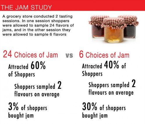
Ultimately, more choices triggers the buyers remorse that Schwartz referred to. It’s a lot easier to know what you want out of 3 choices than out of 24. So keep your merchandise and add-on options at a minimum. Consider which merchandise items are a priority and only offer your top three items. You’ll see your merchandise sales increase significantly.
3. Page Embedding
Across the board we’ve seen this to be the most overlooked mistake when building your ticketing page. Frequently clients request the ability to embedded the page into their website as to not direct the consumer away from the website. While this is possible and you’d think it's a positive thing to keep users on your website, the negative of embedding a registration page into your website, is that you have surrounding clickable links for users to click on. Our blog post “A Case for Keeping it Simple” reminds us that major e-commerce companies remove any and all distractions from the checkout page to focus the consumer to completing the purchase.
The same concept applies when you hyperlink a ‘Register Now’ button to your registration page. When they’ve clicked that button their committed, now you’ll want to strip away any distractions so a registrant can focus solely on completing their transaction. Additionally our pages are so customizable your users may never even notice they left your site.
4. Social Sharing
Having social sharing links on your page are a great tool to drive your traffic and marketing to the social media realm. But having too many social call to actions or misplaced social links can inhibit the effectiveness of your conversions. Taloon.com performed an A/B test in one of their online ads. One had social media buttons on the add, while the other did not:
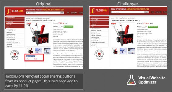
There was an 11.9% increase in their conversion rates when social sharing links were not included on the checkout page. While our software allows numerous avenues for social sharing within your page and we encourage the use of them, social share buttons should be used with care and strategy. For example our Share And Save field drives the incentive to close the sale because of the financial discount a registrant is given when sharing.
Help focus your registrant from distractions and eliminate overuse of these links. You want your customer to share on Facebook, but more importantly you more want them to finish the registration quickly and smoothly.
The paradox today is that more is good. But as shown, in fact, more hurts. Make decisions for your registrants and eliminate unnecessary options to increase your sales and conversions. Have you run into similar experiences with your online forms? How did you approach simplifying your form? Connect with us in chat. We'd enjoy hearing from you.
.png)
.png)
.png)