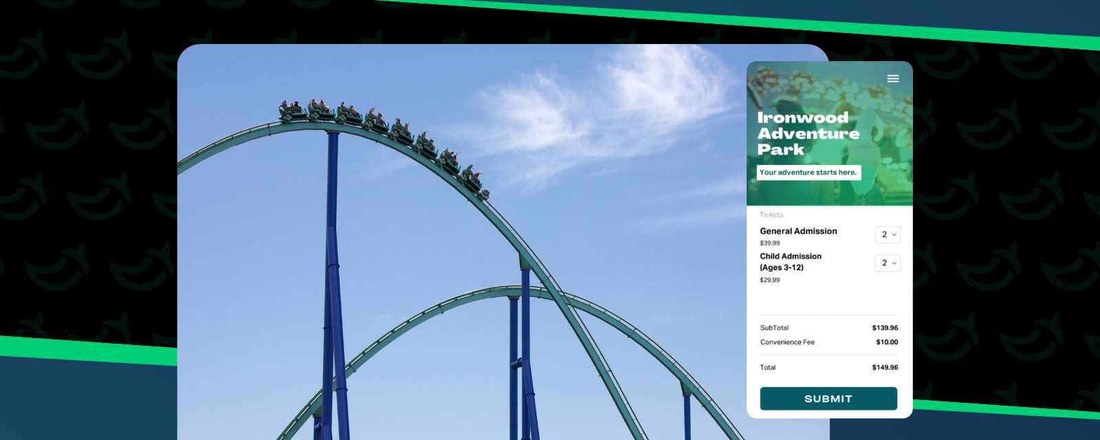
If it's been a few years since you updated the design of your website, you could be missing out on committed purchasers. A well designed website is not only impressive, it adds to your legitimacy. Professional, trendy and function layout in website design inspires a buyer’s confidence and prevents confusion.
While we all can agree that good design matters, it’s not always easy to accomplish. If you’re a beginner, lacking a design eye, or just plain short on time, we’ve put together a guide for you to whip up a design that makes you look like a pro. Here is a list of rules that all the most website designers follow.
Use white space.
To make your job easier, start by removing all the unnecessary lingo and images. If it’s something another page on your website can cover, remove it. You can use additional pages on your website to inform and educate, but when guiding your website visitor towards a sale it's best to be clear and straight to the point.Not only will this make the design process faster, it will also give you a clean look. Margin is modern and white space is relaxing. Don’t feel like you need to add more. Simple is best.
Select a modern font.
Not sure how to do this? Don’t worry! We’ve got you covered. Here are 7 free fonts to guarantee you a modern look. These seven curated fonts will amp up your website's design, ensuring that you won’t have to think twice before selecting fonts in the future.
Or if you really like the font you’re using, you might also consider a font swap. Same vibe, just updated.
Pick the right image.
If you’re using a header or banner image, you want to make sure it’s a good one. Meaning it’s a strong, high resolution image that’s a good reflection of your brand. With so many free, stock photos available right within our software, there’s no excuse for a vague or blurry picture.
Commit to an accent color.
An accent color can take a page from boring to eye-catching. Here is a trick that all the pros use. Scan your website and define what the main color is. Just overall, what do you see? Then use a color wheel to find a complimentary shade. It’s the color that’s across from the main color. It makes buttons and heading texts pop. Once you do it, you’ll start to see this trick everywhere.
Balance it out.
There is a rule for contrast. If you have different elements on the page, make them very different so it doesn’t look like a mistake. Don’t have a header font that’s 12 point and a body text that’s 11 point. Not bold enough! Bump up your header font to 20 point. Now it stands out like you meant it.
Even though it seems like it would do the opposite, large elements will look balanced when paired with smaller elements. Scan your page. If everything looks big, make the less important details smaller. Use this guideline like a highlighter to draw attendees eyes to what you want them to remember.
Great job! Now your website looks like a pro created it for you. And as always, we love to hear from you. Let us know how it worked in the comments below!


